Typography Puzzle, Inspired by Letterpress
Why does this puzzle matter? When working with design students, I noticed how introverted and shy they were in groups, yet how curious and inquisitive they’d be 1-on-1. I also noticed how many of them didn’t understand the nuts and bolts of typography, even though they knew the term, and they knew what it looked like. They had no idea how much they did not know. I wanted to get more people excited about the art of seeing!
Through typography we learn about proportion, positive space, negative space, and systematic thinking. We even learn some math. However, the methods most often use today are centered around clicking, scrolling, and reading from a screen. We’re not engaging multiple senses or kinesthetic movement. What if we took a different approach? What if design basics were taught with toys inspired by letterpress? Could engaging the brain and body change the way our brains perceive and absorb info? These interactive letter forms were created to examine this question.
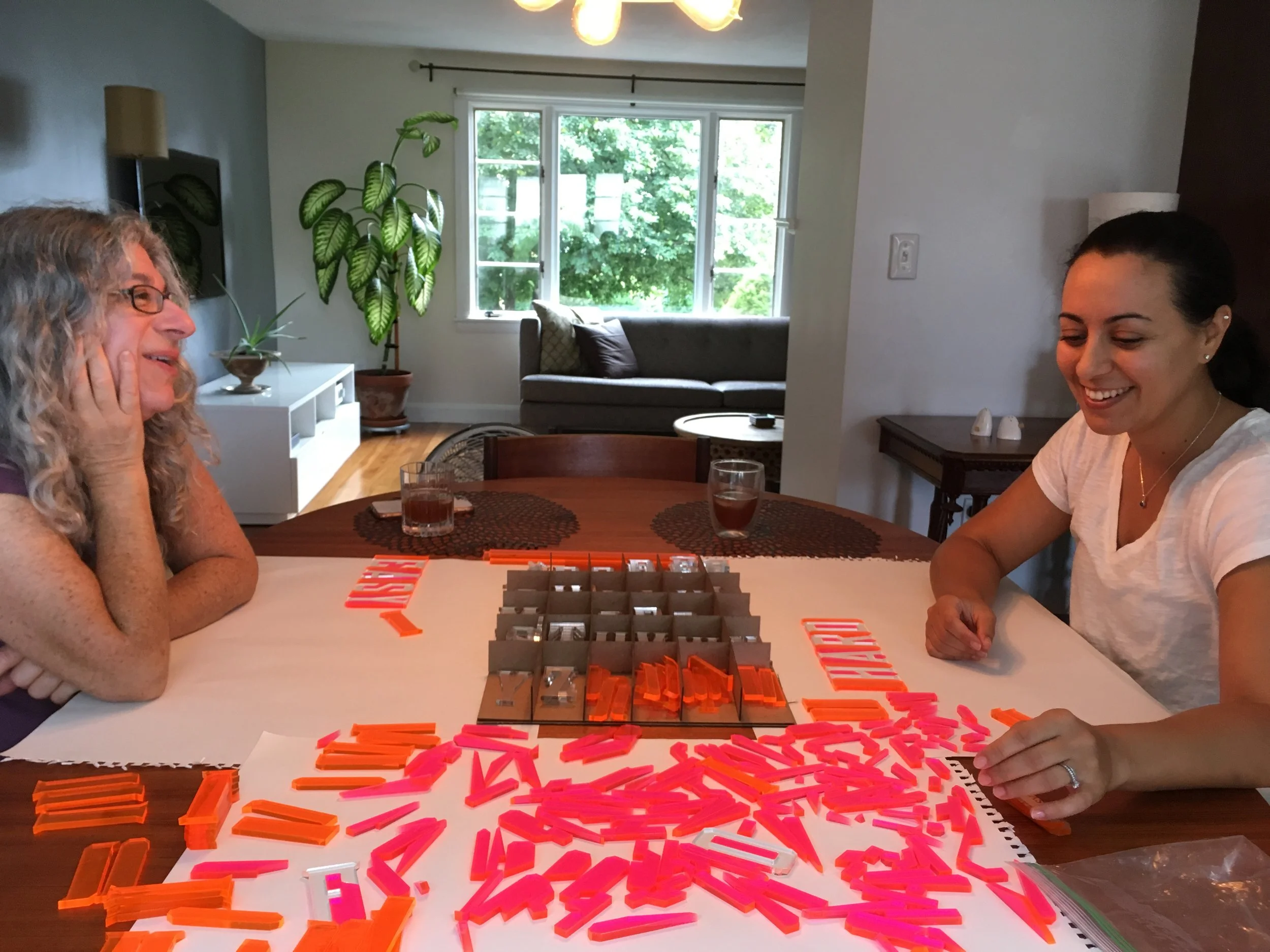
Testing the puzzle for usability, and any missing pieces. This version was commissioned by the library at MassArt
My Puzzle Testers
Historic Background—Within MassArt is a room housing thousands of fonts from the 1800s, known as the T.J. Lyons Collection. While you could view specimens online, visiting in person is a more rewarding experience. Interacting with the type engages your eyes and fingers simultaneously. Typography is tactile! The letterform designs featured below are inspired by No. 500—a font designed by William H. Page and George Setchell from 1887. The original can be found in 7 line and 8 line wood type, at the Lyons Collection.
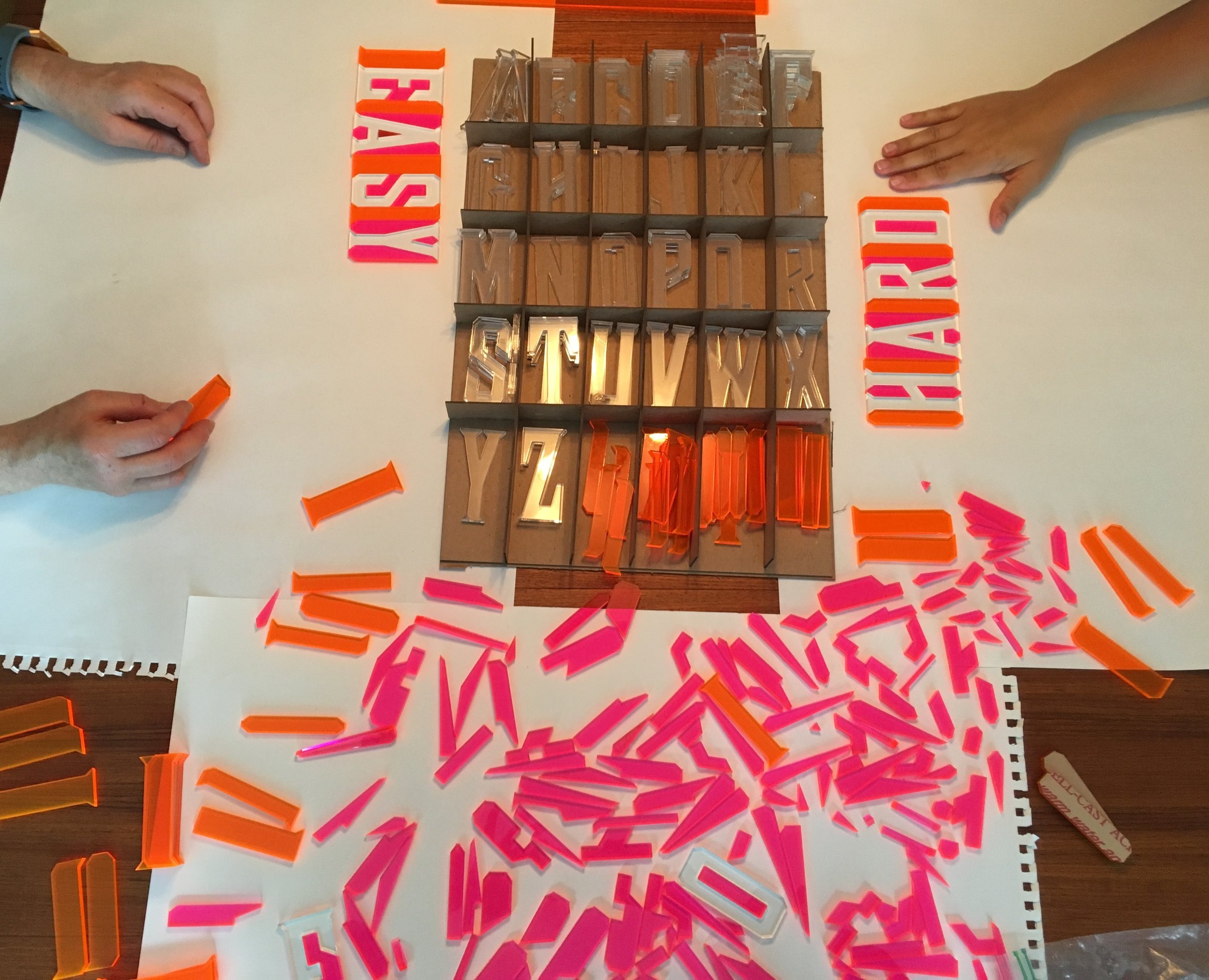
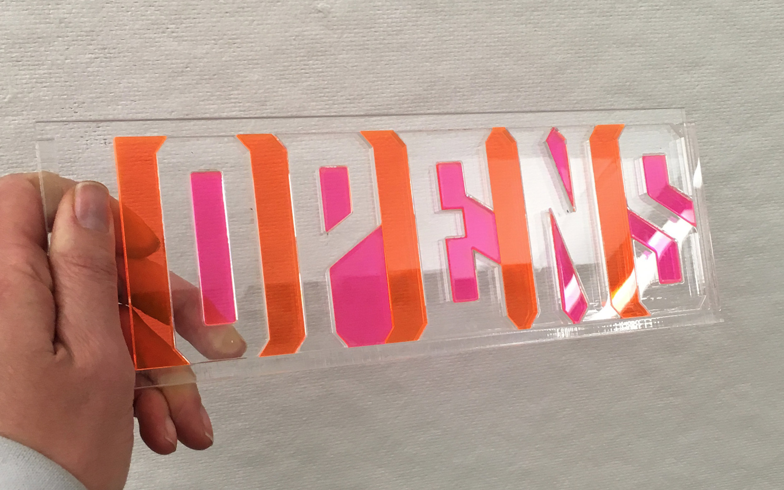
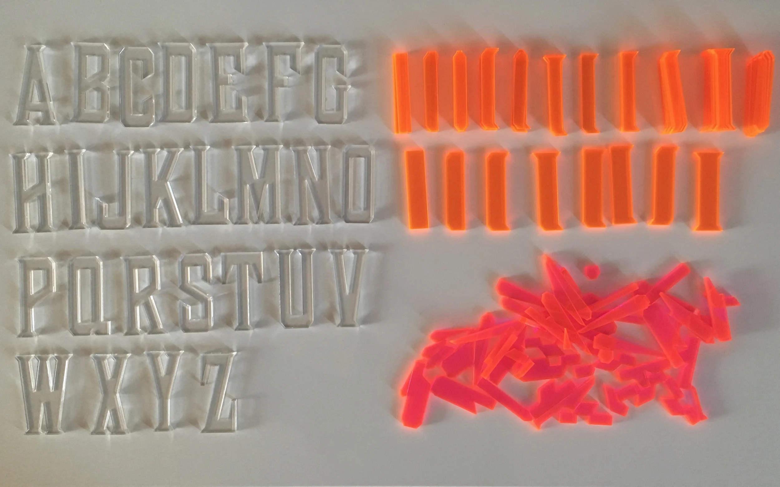
The letters are transparent acrylic. The counters and letter spacing are set in neon. This puzzle is designed to help students see negative space, and engage with it in a playful experimental way.
Neon-orange spacers in a variety of widths allow students to experiment with letter spacing. Proportions are based on letterpress standards. Shown here are 6/em spacers.
Shown here are 4/em spaces (or the font size divided by 4). This provides students with the opportunity to learn some math through design as well.
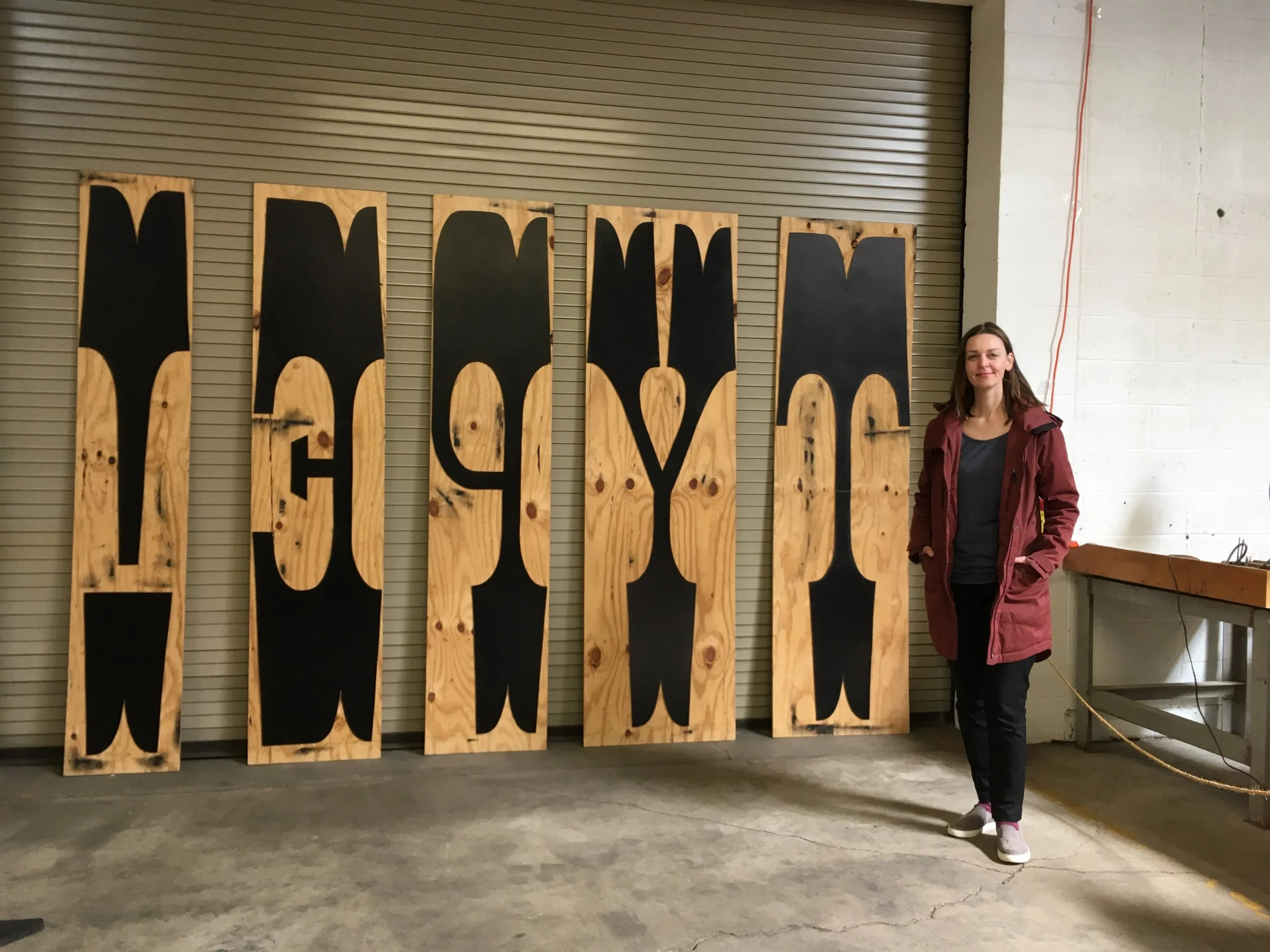
Specimen from the T.J. Lyons Collection at MassArt. Coincidentally, it contains the word "toys"! Happy surprise.
The full puzzle—26 capitol letters (duplicates of a few), Counter form parts, Letter Spacers (in widths based on 6/em and 4/em spacing. Typography teaches us so much!—proportion, history, math, emotional expression too. Typography is the apex of left brain and right brain thinking.
Here I am on my visit to the Hamilton Wood Type Museum in Wisconsin. It was here I learned about die-cut technology and why this was a valuable advancement for the creation of wood type.
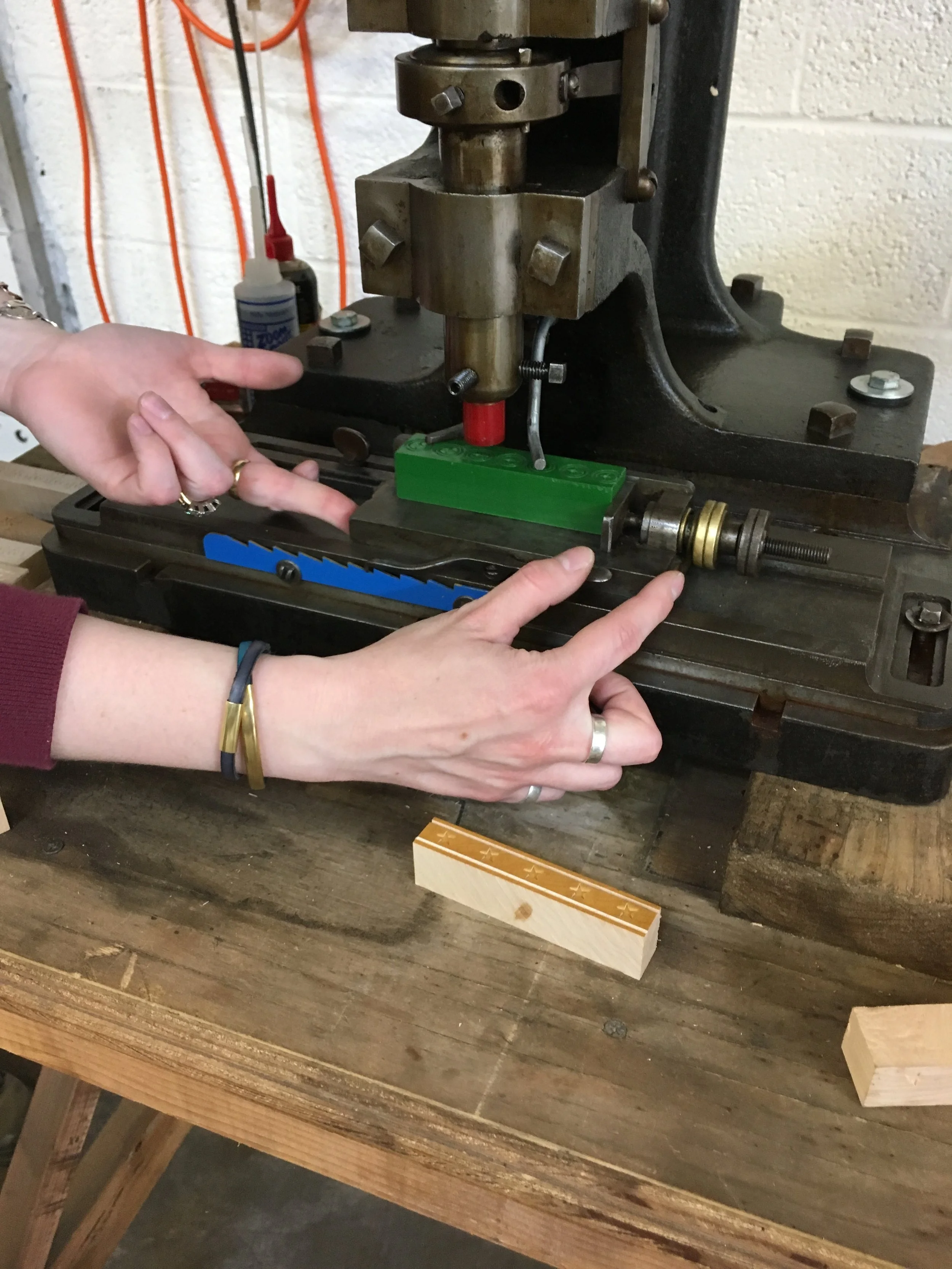
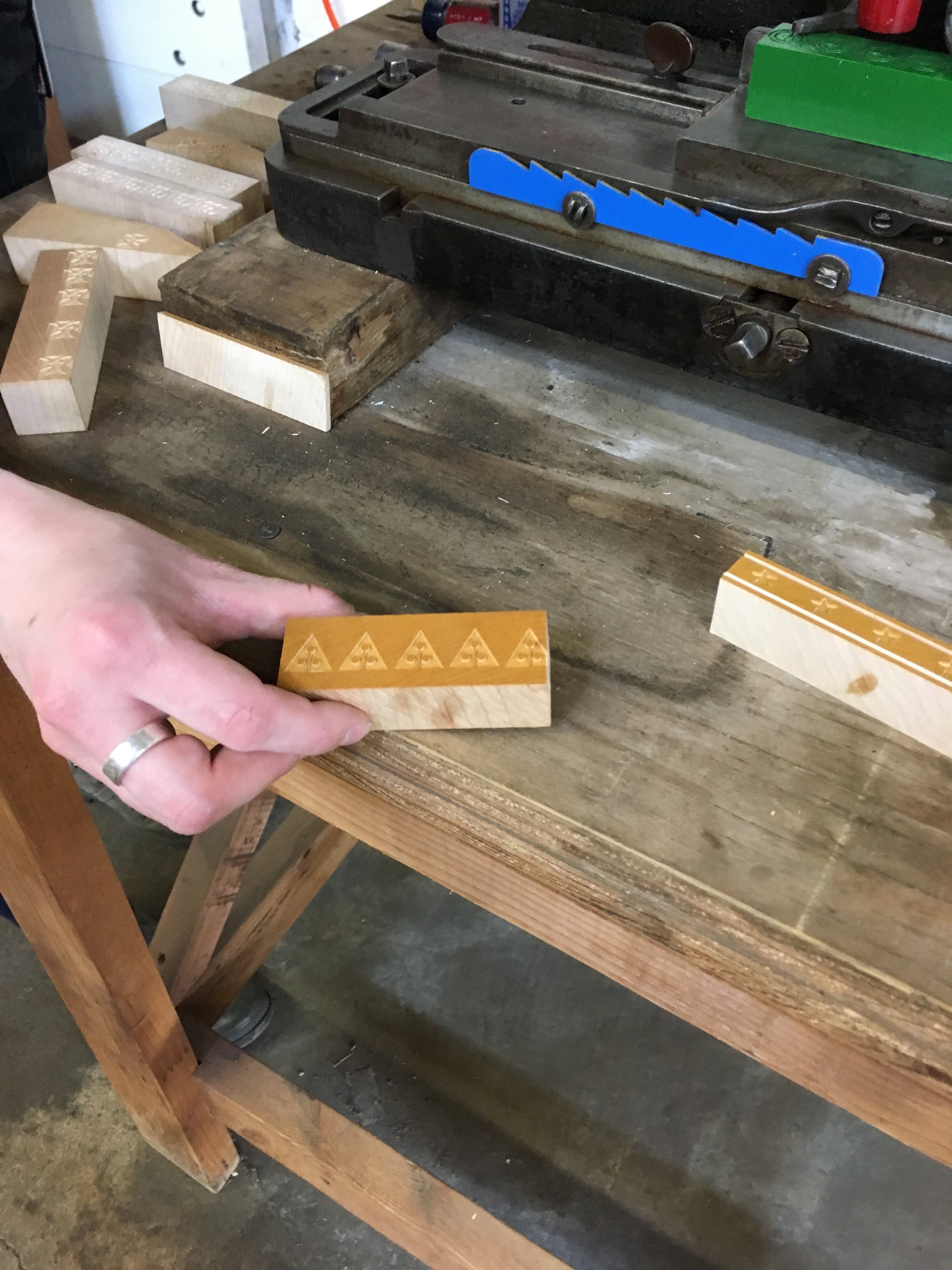
The Die-Cut Method
Using ornamental borders as an example, Stephanie of the Hamilton Wood Type Museum kindly walked me through the basics of the die-cutting process.
