Lisa Florence Design
Personal Projects
A few areas I’ve nerded out on in my spare time (in other words, a fun way to get to know me without NDA restrictions)

A few areas I’ve nerded out on in my spare time (in other words, a fun way to get to know me without NDA restrictions)
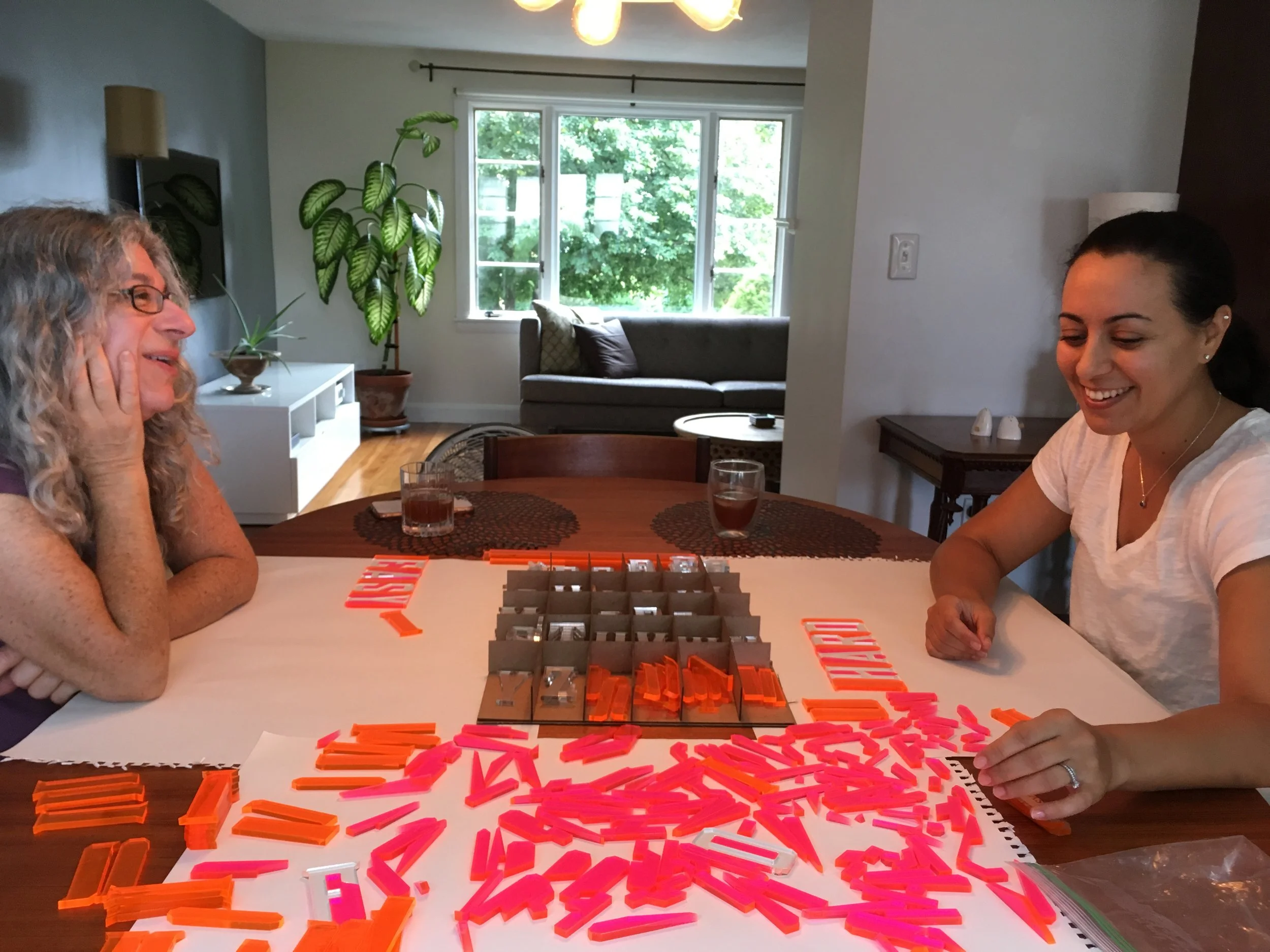
I designed and manufactured these blocks. Another creation for my play-as-learning series.
This site is an artistic interpretation, based on the narrative of the Stanley Kubrick film, 2001: A Space Odyssey.
The first screen is geography based navigation of key scenes. In this example, the location of Space Station is activated. The sub menu reveals choices for specific film scenes that take place here.
From the previous screen, the viewer clicked “space station” to reveal a more-detailed summary of scenes from this location.
Here is a specific-location landing page. The visual focus is a scene clip. Secondary information is a written summary of key plot points, and potentially related scene for comparison.
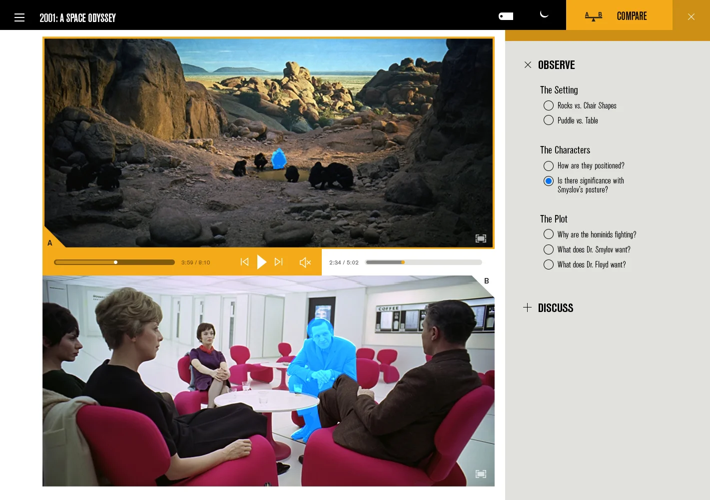
Two scenes, side by side. Each scene features a short description, and timeline slider, for easy queuing. The most unique aspect of this interface design is the player bar.
I came up with this unique player-control system that allows viewers to control either clip independently, or simultaneously. In this view the entire bar is yellow, which means the play-button will control both the clips in unison. If you want to deactivate either scene, you can click on the corresponding half of the yellow play bar, or on the corresponding location icon in the right column.
Clicking the icon at the top right of the global bar, triggers a drawer-like panel of directive scene topics to take not of.
Each scene features a group gathered around a “watering hole”. The blue highlight illuminates the similarities with hominid and Dr. Smyslov.
Are the shapes of rocks and chairs deliberately similar, or merely a coincidence?
The Watering Hole scene is active, the Lounge scene is paused, and deactivated.
A variety of scene comparison pairings featured on this site.
Another example of what a scene-comparison page could look like with alternate content.
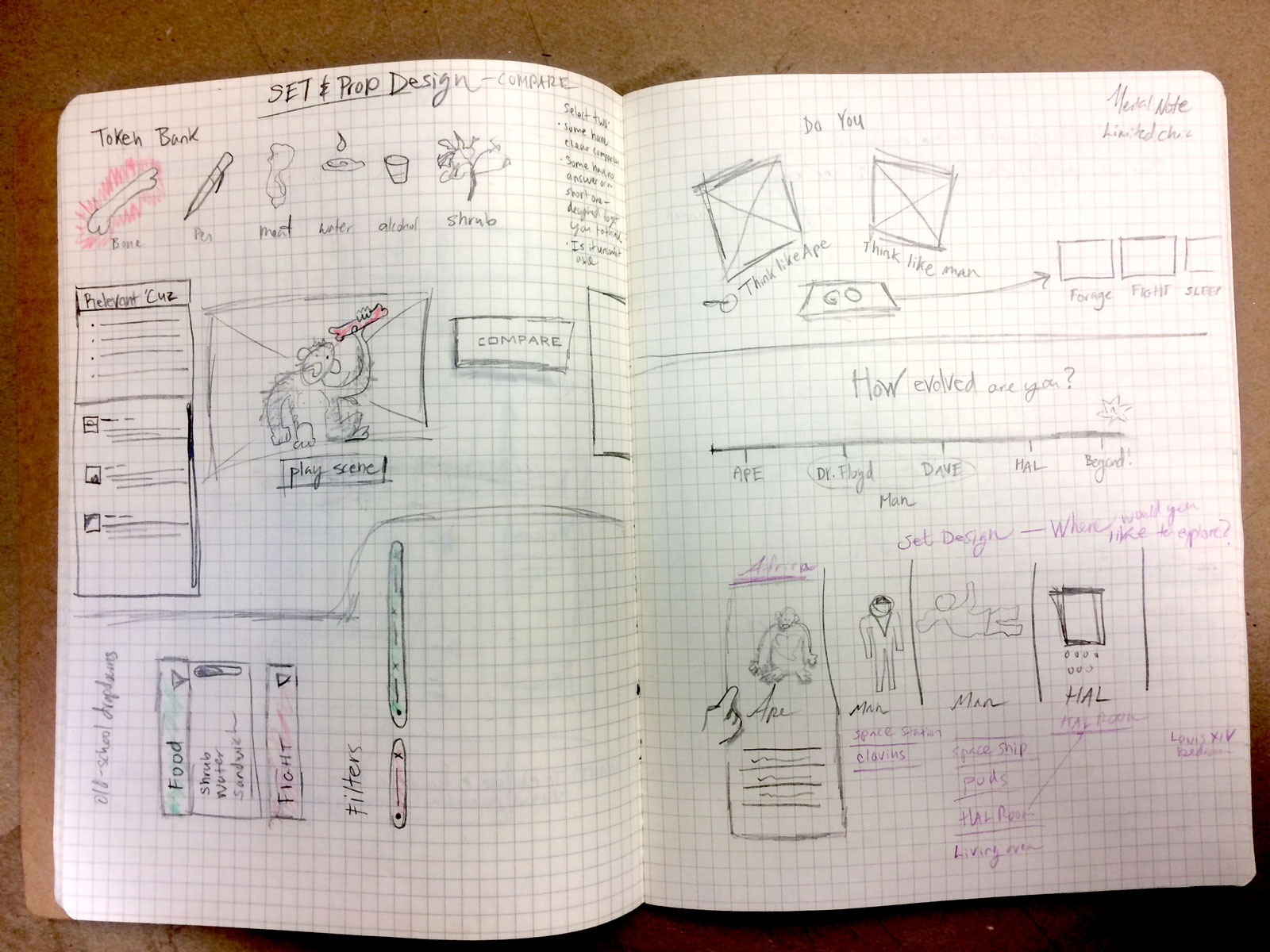
This website is the result of a student project. The assignment: take the narrative of 2001, extract data points of your choice. Design a site that allows a viewer to explore these data points. The data I selected related to strong visual symbolism, structure and theme. Therefore, I designed a scene-comparison product. Here are some of my process sketches that helped me reach my final concept.
A magazine about design innovation in response to problems around affordability and quality of life.
Rural living and reclaimed architecture.
Triple-page fold out detailing various configurations in Yolanda Pila’s Madrid home.
My editorial design is based on the story of Yolanda Pila and her amazing Madrid home. The lettering is wonky and angular with modularity and movement.
This spread features my lettering, layout and content-selection capabilities.
This article features Brad Kittel, a remarkable Texas tiny-house artist. Kittel owns numerous warehouses choc full of salvaged house parts.
Responsive and reconfigurable, and recognizable.
Clear and direct, just like your travel experience should be.
Inspired by the TJ Lyons Collection at MassArt, Boston, MA.
Neutral Milk Hotel Lyric set in 30 pt Arrighi, with ornamental border.
Typesetting
This Arrighi font beautifully showcases a swash that breaks the bounding box! If this were code, what would happen? Well, luckily side bearings (which exist in metal type), also extend to digital typography.
Ironically, it was through the art of letterpress and old-fashioned typesetting, that I truly began to understand the fundamentals of web-based typography. Typography, like code, is a system. Every element is thoughtful, intentional, and created to work together.
Here’s a short description I wrote (and set in 11pt type) about a relating project— The Letterpress Puzzle.
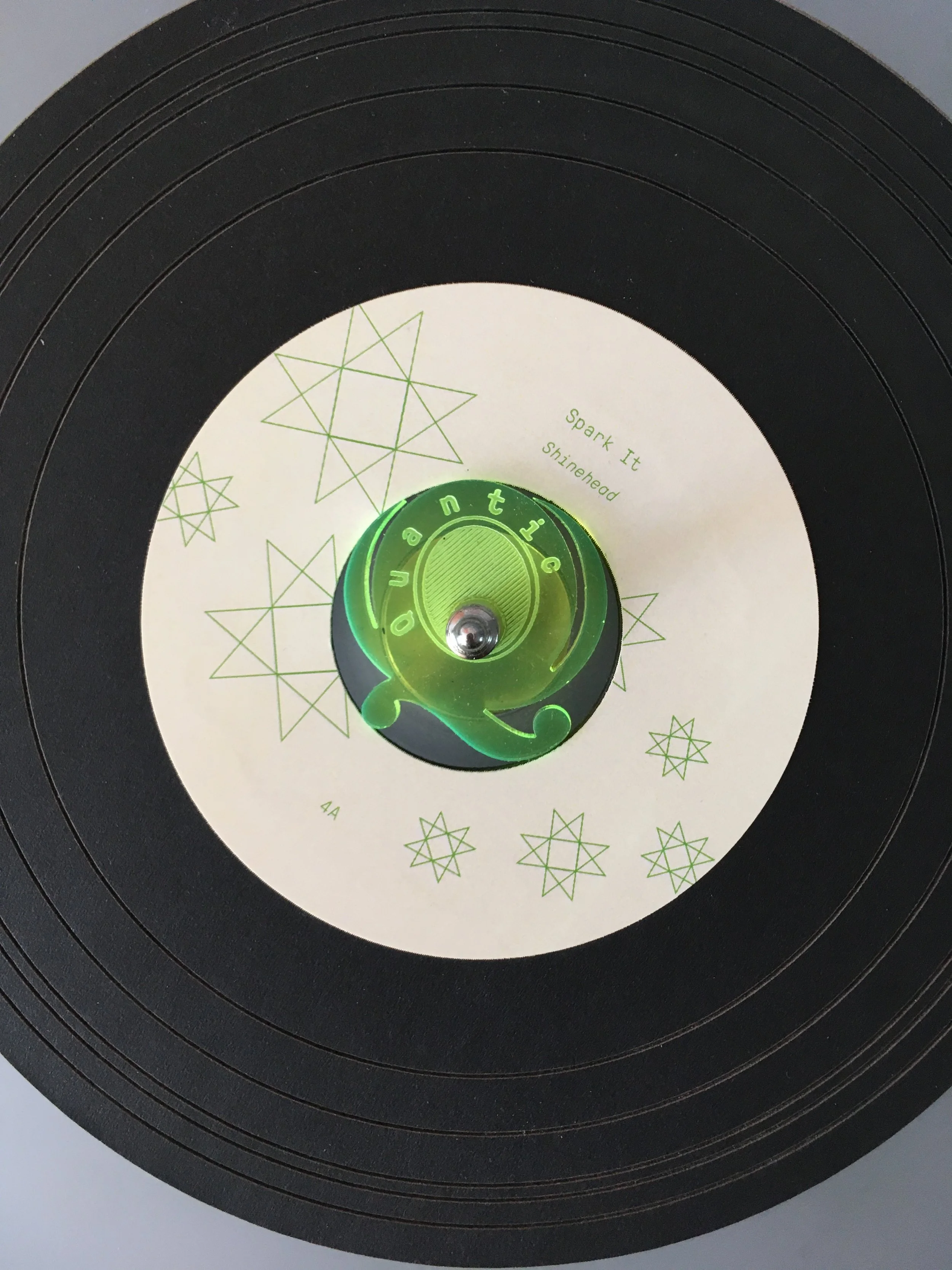
This is a boxset I created to explore my fascination for Will Holland, a British DJ and musician better known as Quantic. This project is a set of six 45s, packaged in an easy to access accordion folder, safely tucked into an acrylic case for travel. The case included a 45 adapter, branded with the artist’s logo.
Booklet and six 45s inside.
This page features song information.
The 45 adapter in use
We can’t see color without ample light, so every record is given an unique label pattern. This aids with quick identification in low-lit places.
The acrylic packaging has little windows so you can easily see what’s inside.
All patterns in this set are based on the incredible tile floor patterns found through Colombia—the country that inspired Quantic’s music for this box set…with all that dancing, “If floors could talk!”
Six 45s are snuggly tucked into an accordion folder when closed. Expanding the folder changes the tension, and allows for easy record removal. I believe in convenience, and for DJing this means being able to safely grab a 45, single handed.